I OCHA LOGO
Services: Brand Design
Role: Branding / Logo Design / Package Design
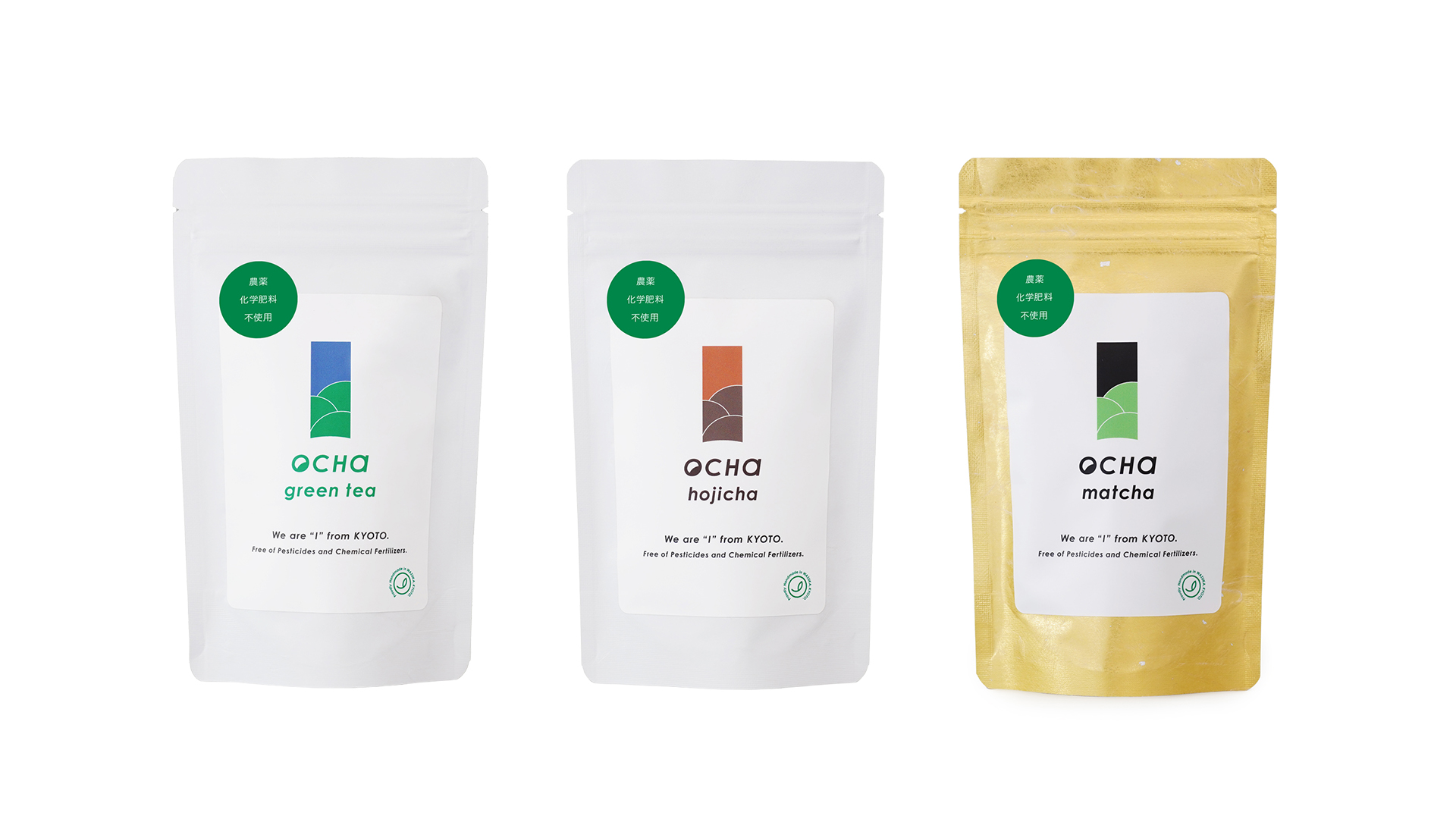
We designed the logo and packaging for “I OCHA,” a new tea brand launched by “I,” a private members-only gym based in Tokyo.
The brand owner was deeply inspired by the rich nature and deep flavor of the tea fields in Wazuka, Kyoto, and wanted to share that experience in everyday life.
The design takes inspiration from Wazuka’s unique tea ridges, turning their gentle curves and natural rhythm into the symbol mark “I.”
With a vision to bring Japanese tea culture to the world, we created a design that stands out in overseas select shops — not a traditional “Japanese” look, but something modern, catchy, and refined.
The tea lineup includes Green Tea, Hojicha, and Matcha.
Each flavor’s color palette reflects the changing scenery of Wazuka — the bright green fields, the warm sunset, and the calm moonlit night — expressing the land’s rich beauty and depth through design.